There's a certain kind of arrogance that infects software teams — the belief that a user who 'doesn't get it' is a user problem. In reality, it's almost always a design problem. And nowhere is this more true than when you're building for people who didn't grow up with software as a native language.
Who We're Actually Building For
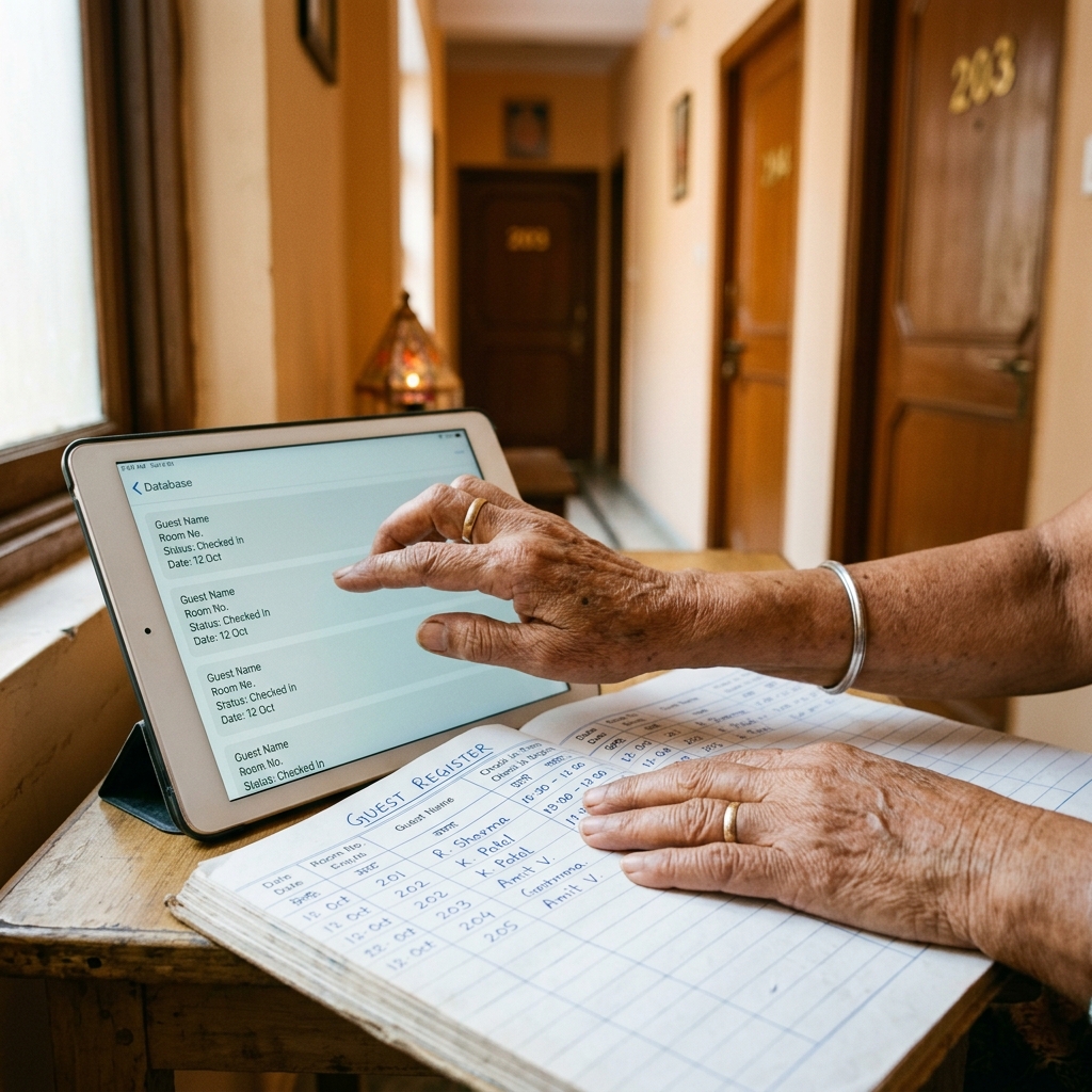
Our users are PG owners managing 40 rooms across two properties. Cafe managers who've been running their shop for 15 years on paper. Small business owners who are brilliant at what they do — cooking, hosting, managing a team — but who have no patience for software that fights them.
The instinctive response is to add a tutorial. An onboarding flow. Tooltips. A 'Help' section. These are symptoms of a bad design, not solutions to one. If a user needs a manual, something in the design has already failed.
The 'Grandparent Test' We Actually Use
We have an informal rule: if we can't explain what a screen does in one sentence, it does too many things. Complexity is almost always a product decision made upstream, not a UX problem to be papered over downstream.
The first principle we design around is: no dead ends. Every screen should always have one obvious next action. Not three options, not a menu — one button, one call to action, one direction. When users get stuck, they don't read help text — they leave.
Language as a Design Material
The second principle: write copy like you're talking to a person, not a system. 'Record Payment' not 'Log Transaction'. 'Add your room types' not 'Configure inventory units'. 'Remind tenant' not 'Send automated notification'. The words on a button are doing as much design work as the button itself.
- Use the language your user actually speaks, not the language of the system
- Every error message should suggest what to do next
- Confirmations should say what just happened, not just 'Success'
- Numbers should be formatted the way Indians read them (₹1,20,000 not ₹120,000)
The Engineering That Enables Simple UX
There's a paradox at the heart of building simple software: it's significantly more technically complex than building complicated software. When the UI needs to be simple, the backend has to be smart. Automations that would normally require user configuration have to be inferred. Defaults have to be right the first time.
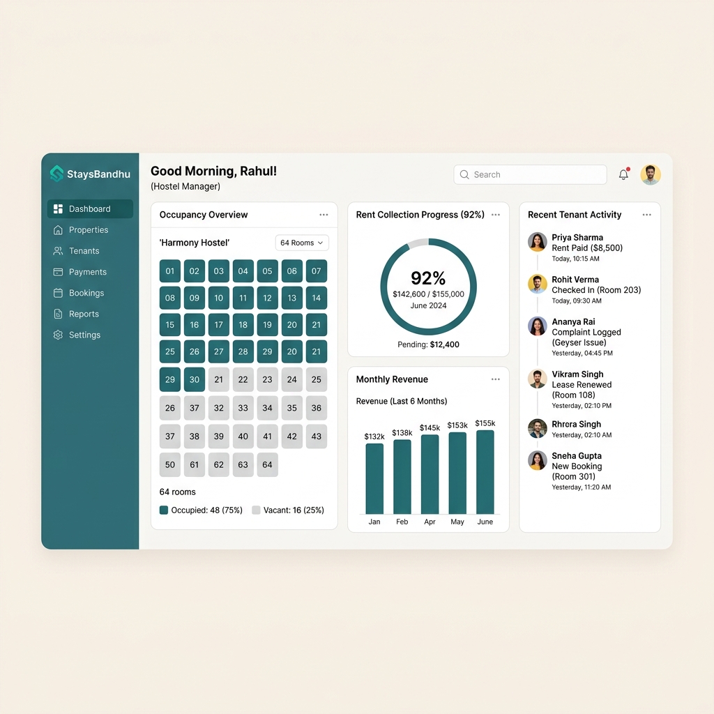
For StaysBandhu, we spent weeks on the rent reminder logic alone — figuring out the right defaults for reminder timing, escalation sequences, and payment reconciliation — so that a PG owner could turn it on with one toggle and never think about it again. The technical complexity was significant. The UX was a single switch.
What This Changes
Building for non-technical users forces a kind of discipline that makes software better for everyone. When you can't rely on the user reading documentation, you have to make the product self-explanatory. When you can't rely on the user configuring things correctly, you have to make the defaults correct. When you can't rely on the user troubleshooting errors, you have to not produce them.
You might also like
Why PG Owners Are Still Chasing Rent on WhatsApp
India's co-living boom is real, but most PG and hostel owners still run rent, rooms, and complaints out of a notebook and a WhatsApp group. Here's what that's quietly costing them — and what changes when operations go digital.
Read article
Why Indian Cafes Are Still Running on WhatsApp and Notebooks
Most cafe owners in India manage orders, inventory, and billing through a mix of WhatsApp groups, paper notebooks, and gut feel. Here's why that's costing them more than they think.
Read article
Why We Run a Services Business and a Products Business at the Same Time
Most companies choose one: agency or product company. We chose both — intentionally. Here's the thinking behind Urbandhu's dual model and why it makes us better at both.
Read article